- cross-posted to:
- fediverse@lemmy.world
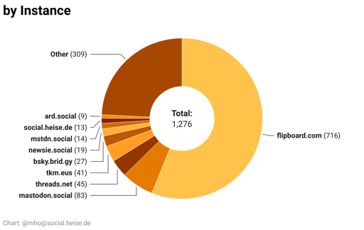
It’s now way prettier and contains almost 1300 accounts.
You can show/hide columns, there is a powerful custom search and a button to download an CSV with the handles of all visible accounts for import. There’s also the language, the country of origin, and a direct link.
Need an eyedropper tool to figure out which color represents each country
With a mouse, you can hover over it and it will highlight the corresponding part.
No mouse on phone :( why not use the full spectrum of colors? There’s like a 1 shade difference between each one
That’s the standard in DataWrapper. From my experience they surely have a blogpost on why this is the only right way to do it. 😉
That’s so weird, It’s great info but so hard to parse!
Thanks, very usefull!
Those pie charts are really hard to read. Those colors are too similar.
For a second it had me thinking Im color blind
There are numbers, too.
But I’ll look into it. I’m using DataWrapper and it’s not very customizable.
My guess is that these out of the box colors are probably fine with 3 or 4 things. But with a lot of items, you’re really forced to rely on the key.
Yes, you’re right. I changed tha graph for instances and will look into the others. But not today 😴
You don’t like 4 shades of blue?
Doesn’t seem to work on firefox Android
It takes a couple of seconds to load the data.
Oh, sorry